
Over the last decade, smartphones have completely transformed how we interact with the digital world. From online shopping and banking to learning and entertainment, mobile devices have become the primary gateway to the internet for billions of users. As a result, mobile-first experiences—designing digital interfaces with mobile users as the top priority—have become the new standard for forward-thinking businesses.
Insights shared via Dailystar further emphasize this shift, noting that mobile engagement rates are significantly higher than desktop in most sectors. Users are more likely to make purchases, engage with content, and revisit platforms that are optimized for mobile use. This data underlines the growing expectation for seamless, responsive, and fast-loading mobile experiences across industries.
The rise of mobile-first experiences isn’t just a trend; it’s a necessary evolution. With mobile traffic consistently outpacing desktop, digital strategies must be tailored for the smaller screen first—and then scaled up for larger devices.
What Does Mobile-First Really Mean?
Mobile-first design is a strategy that starts with the smallest screen in mind. Rather than adapting desktop designs to fit mobile screens (a method known as graceful degradation), mobile-first takes the opposite approach—beginning with essential features and simple layouts and then adding complexity for larger screens.
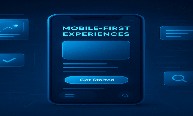
A mobile-first experience typically includes:
- Clean, minimalist design
- Responsive layouts
- Optimized content hierarchy
- Fast loading speed
- Touch-friendly navigation
The objective is to provide seamless, efficient experiences on mobile devices—where space is limited and attention spans are shorter.
Why Mobile-First Is Critical in 2025
- Mobile Usage Dominates Internet Traffic
As of 2025, over 60% of global web traffic originates from mobile devices. Consumers are using their phones for browsing, shopping, streaming, and social interaction. Ignoring mobile design is essentially ignoring the majority of your audience.
- Google’s Mobile-First Indexing
Google now predominantly uses the mobile version of a website for indexing and ranking in search results. If your mobile site is slow, poorly designed, or lacks essential content, your search visibility may suffer.
- Improved Engagement and Conversions
Mobile-optimized sites offer faster load times, intuitive interfaces, and streamlined content, which all contribute to better user experiences. These factors lead to higher engagement rates and, in the case of eCommerce, improved conversions and reduced bounce rates.
- Competitive Advantage
Brands that prioritize mobile-first design often stand out from competitors. A smooth mobile experience can boost customer trust, retention, and overall brand perception.
Industries Embracing Mobile-First Design
Mobile-first experiences are impacting nearly every sector. Here are some leading industries:
- eCommerce: Mobile shopping apps and responsive websites are now a baseline expectation. Features like one-click checkout and personalized product feeds cater to mobile users.
- Banking & Finance: Most banks now offer full mobile banking apps with features like facial recognition, real-time alerts, and investment tools.
- Healthcare: Telemedicine platforms and health tracking apps have made mobile health a fast-growing segment.
- Entertainment & Media: News platforms, streaming apps, and games are designed to deliver immersive experiences on the go.
Elements of a Great Mobile-First Experience
To create a mobile-first experience that truly resonates with users, focus on the following:
- Simplicity in Design
- Use clean layouts with clear CTAs.
- Eliminate clutter to ensure users find what they need fast.
- Performance Optimization
- Compress images, use lazy loading, and minimize scripts.
- Mobile users often rely on slower networks, so speed is essential.
- Responsive and Adaptive Layouts
- Ensure your design scales smoothly across all devices.
- Use flexible grids and media queries in your CSS.
- Thumb-Friendly Navigation
- Place key actions (like buttons and menus) where thumbs naturally reach.
- Avoid small touch targets that can cause frustration.
- Prioritized Content
- Present the most important content first.
- Keep copy concise and easy to scan.
Tools and Technologies Powering Mobile First
Creating mobile-first experiences has become easier thanks to advanced tools like:
- Progressive Web Apps (PWAs): These apps combine the functionality of native apps with the accessibility of websites.
- AMP (Accelerated Mobile Pages): Developed by Google to speed up mobile content.
- Responsive Frameworks: Tools like Bootstrap and Tailwind CSS help streamline mobile-first development.
- AI & Machine Learning: Enable personalized mobile content and smarter app interactions.
The Future of Mobile-First Experiences
As mobile technology continues to evolve, so will the expectations of users. The future of mobile-first design includes:
- 5G Integration: Faster speeds and better connectivity for real-time interactions.
- Voice Search Optimization: As more users rely on voice assistants, mobile content must be adapted to natural language.
- Wearable & Multi-Device Experiences: Designing for smartwatches, AR glasses, and other mobile-driven devices is becoming essential.
- Hyper-Personalization: AI will power mobile-first platforms to deliver unique experiences for each user based on behavior, location, and preferences.
Final Thoughts
The rise of mobile-first experiences marks a pivotal shift in digital design and strategy. It’s no longer enough to simply “optimize” for mobile—brands must lead with mobile.
By embracing mobile-first principles, businesses can future-proof their digital presence, meet evolving consumer expectations, and deliver seamless, satisfying interactions across every screen.
In the mobile age, success is measured in seconds, scrolls, and taps—and your ability to get it right starts by designing for the device in your customer’s pocket.